Wednesday, 18 December 2013

Stop Motion Animation-Participation


Recently, we had to make a stop motion motion animation, but we also got a word, which my groups was 'Participation'. In ours, we chose four different celebrities, the put them together in a gym class. Basically what happens is that one of them does not want to participate in the current activity, which was basketball, so the other three try getting them to actually play, until eventually they do. 
This was a bit difficult at first, since me and my group had NO idea how to make a stop-motion animation with 'participation', but soon it became slightly easier, and we got it done. Here is the video above, and i hope you enjoy it :)

Photoshop practice- taking something from one picture and pasting it to a new background


So in class, we were shown a tutorial of how to do some things in photoshop, this involved selecting something, like a person, from another picture, removing their background, and pasting them on a whole new background, and do a few things until it looks like it fits in, or blends with the pic. in this case, I took a picture of a cosplayer, and a nice sparkly background, the my steps. 

Firstly, I obviously saved the pictures and opened them in photoshop, I took the cosplayer, and dragged the image onto the sparkly one. I then used the quick selection tool, and took like, 20 minutes selecting around her so I could actually get everything. When I was satisfied with the selection, I used refine edge, and selected it so it looked like what it would without the background, and took away any remaining parts from the original background, then clicked okay. And the cosplayer was only on the sparkly background. 
Then, I adjusted things such as exposure, brightness and contrast, before selecting the cosplayer through a mask, deleted the lock on the background layer (which was the sparkly-ness) and made a new layer with it via copy, so part of the background was in the shape of the cosplayer. I moved the layer up over the person, set the layer to color, and adjusted it until I was happy. I also put some white over her, just to brighten her up manually a bit more.

Neither pictures belong to me, the cosplay picture was found here, and all rights go to her; http://dantelian.deviantart.com/art/Levi-cosplay-409034284

And the sparkly picture:  http://mysticaltemptress.deviantart.com/art/Sparkly-Background-153695208

Friday, 13 December 2013

The Musketeer


Title:The Musketeer

Artist: Henri Matisse (1869-1954)

Date:1903

Medium:Oil on canvas

Dimensions: 31 3/4 x 23 1/2"

What I really like about this piece is the colors the artist used. They are relatively dark, but despite the dark colors, you still get a feeling of power, and slight happiness, mostly from the 'musketeer' in the image. But other than that, everything is okay, it was just the colors pretty much though. 

Thursday, 12 December 2013

Emergency Room


Title:Emergency Room

Artist: Robert Colescott

Date:1989

Medium: Synthetic Polymer paint on canvas

Dimensions: 299 x 289.8 cm


Like "Fire", "Emergency Room" is a fairly busy picture, but it is still very interesting nonetheless, so its not overwhelming in any way. Its realistic in terms to the subject of the painting, but its surreal in a way, which is why I like it. 

Fire


Title:Fire

Artist: David Wojnarowicz 

Date: 1989

Medium: Synthetic polymer paint and paste on plywood, two panels 

Dimensions: 6 x 8'


This painting quickly sparked my interest. It seems a bit random, yet cool at the same time. My favourite part of the image is actually the top left corner. With what looks like a person, a volcano, a snake, all surrounded by...I think newspaper or buildings, that I'm not to sure of. Another thing is that this painting is very busy, yet still interesting, so it makes you want to look at almost every small detail throughout the entire picture. 

Thursday, 7 November 2013

Manny-Creepy stop motion animation


Manny is a creepy stop motion animation created by Adam Rosenberg, which involves a...'beautiful' mannequin head, and a few other things. I know its a bit bloody and whatnot,but I found it very interesting to watch. it basically involves some tampering with the mannequins face and head, and it gradually gets stranger throughout the video. Its similar to another stop motion by David Firth, called crooked rot, which is as well involves mannequin heads like in this video, tampering with the face and whatnot.

Just  a warning though, the video does involve some blood/gore, and is a bit creepy, so if you're not comfortable with things like that, then I suggest not watching it. Though if you don't, go right ahead! :D

Some people might be thinking why I'd even watch a thing like this and think it was actually interesting since its so bloody. But thats not why I think its interesting. I think its interesting

Gulp-stop motion animation


Gulp is the largest stop motion animation video in the world. To not spoil anything, its just pretty big. Another thing is, there isn't any professional photography or cameras, nor was there stop motion animation programs used while taking these pictures; they were all taken on Nokia phones, which is pretty impressive. What I learned from this is that not all stop motion animation is small, made out of clay, or anything like that, stop motion animation can be any size, made with anything and almost everything. Out of the two we had to watch, Gulp was most interesting and awesome to me. I really recommend you watch it! :D

Thursday, 24 October 2013

Chess Piece class assignment- The fall of a king


Chess Piece Class Assignment-The Fall of a King

We were given an assignment where we had to choose a chess piece, make a few thumbnail sketches,  settle on an idea, then draw it out making a composition that was; thoughtful, complex, effective, using line, pattern and/or rhythm. 

I am pretty proud of this drawing, and I believe that I achieved all these aspects fairly well.
It was a bit difficult at first though, my first good copy got ruined, and I was pretty sure I wouldn't be able to do it in time, or be able to make the whole drawing at all without it getting ruined again. But after a whole lot of work, it turned out good!

When it comes to realism, I'd say that was done fairly good. Despite the fact that the regular kings bottom is a bit slanted and off...though other than that, I am proud of it and I'm glad how real they both look.


The patterns in this picture are the checkerboard floor, the clouds, the cape, and the chain coming down from the top of the picture and going down to the ruined king in the back, as well as that ones ruined cape and falling crown. It took much thought to actually settle on these to make actual movement, pattern and/or rhythm. I mean, I had the original idea of the picture itself  for the longest time, but I never thought about adding these things to make what I needed to put possible. The way the cape flows, and the stripes going down it, gives the feeling that this cape is blowing in the wind, as is the torn, ragged cape on the ruined king. The way I drew the ruined kings crown makes it look like its falling off, as he gets whisked away by the chain and ball coiling around him. The stripes on the actual kings cape is a slight repeating pattern, as is the checkerboard and the chains on the chain ball, since it repeats over and over to either give a sense of movement, or is there for just patterning purposes.

Throughout the entire picture, I'm sure that I used a pretty wide range of value on everything, though the value that was used almost the most, was the darker values, from the grays to the blacks, though I made sure we had brighter values in there too, so I played around with the lighter values on the king, since he's supposed to be the one in 'power', and he's in the light, though soon to fall as well. so I made it look like he was in the light in the 'kingdom' he's ruling over, since he still hasn't fallen and is still strong and powerful. as well on the floor,  the white squares on the checkerboard also have a lighter value, again mostly toward the light as well, but they still have light value.

Like I said, I have had this idea in my mind for the longest time. To be honest, when I first had the idea and drew it for the first time (I have the original draft at home),  it looked much different. The kings were side by side in the middle, the ruined king had actual wounds on him. He was burnt, sliced, etc, and it looked nothing like it does now.  After we got this assignment, it wasn't on my mind at the time, so I jotted down so many ideas...and when it finally came to me, I had to change it as much as I could so it would meet the expectations of the assignment. So instead of having the kings in the middle, I moved them further from one another, ending up with the regular king on the left, and the ruined one in the back on the right.

It was a slight challenge to make the regular king (the chess piece) the focal point. At first it was the ruined king as the focal point, and that wasn't supposed to happen. so I had to tweak and tweak and tweak so it wasn't. I made the background darker and darker with my 2B and 6B pencil (mostly the 6B) until the ruined king blended enough. Then I worked on the regular king, erasing and using my HB pencil to make some shading lighter on it and bringing more light to him, to make him the focal point. And in the end, it turned out to be as such.

So all in all, I believe I achieved these aspects pretty well, and I'm  proud of how my work turned out :)


Thursday, 3 October 2013

Logo Assignment


Where did I begin?

I believe i'm a wolf, or at least like one. I am sometimes a pretty independent person, though I am good when it comes to being in groups, and I actually prefer it that way (because, well...if I'm not with a group, I'll get WAY lost). I care the most, and almost only for the people I'm close to, since they've been with me longer and I wouldn't want to lose them. And if you mess with them, or make them upset, you'll have to deal with me. Though if something goes wrong for myself, I'll turn to them for support. I believe these qualities that I have in common with wolves are fairly good for a CyberARTS related career, since in mostly all jobs you need to work in groups sometimes, that and I need to know how to stick up for myself, and others, just in case something happens!

Elements and Principles 

For my logo, I believe that the majority of the lines used were very thin and smooth, while some others were thick and large. The typography I used goes on a slight arc across the yellow circle, and is just on top of the orange circle. The Font used was Myriad pro in bold, making the lines for the text seem dense and confident. Adding these all together, it makes a fairly simple logo thats easy to remember. I chose the circles to symbolize the moon, the lighter one most notably, the orange one was added to include more color in the logo. And since I am a bit laid back and like to simplify things, I think making a logo like this both fits my personality, and is somewhat eye catching. If there was any movement in the image, it would have to be the typography. it (in my opinion) catches the eye first, since its the darkest color among the others, and that then leads you down the bright yellow circle to the wolf, and then up to the orange circle. 

Getting Technical


Despite me saying that I wanted to make the logo simple, it was a pain in the butt to make, since I haven't really learnt how to use illustrator that well yet, I know the tools and some functions, but things go well for a few minutes, and then I screw up and all hell breaks loose. Though after working out those problems, I managed to get it done! the tools I used were the pen tool, the selection tool, the direct selection tool, type on a path tool, and a LOT of the eraser and scissor tool! I didn't really learn much more about these tools, since the presentations made in class helped a bunch. Though, I did learn to be more patient with the pen tool, since I was going far too fast and screwing up everything. Within my whole picture, I used five layers in total, one having the original picture, then the wolf, the yellow circle, the orange circle, and the typography. And from what I remember, no effects were used. I did try the gradient and different layer effects at one point, but it never came up in the finished product.

My Thoughts and Opinion


In all honesty, I am pretty happy with how my logo turned out. If I had more time, I'd experiment a LOT more with the different effects and whatnot with illustrator, but I was quickly running out of time, so I needed to hurry up and finish, so I could also get the written portion in. And what I learned about designing a logo was it takes much more thought, work and effort than I originally thought, since a bunch of ideas pop in your head, and its either "Its too complex", "Its too simple", "Its too colorful", "Its not colorful enough", "the colors don't pop". And then sometimes when you settle on an actual idea, it doesn't come out how you had hoped, you get frustrated and everything goes wrong, and then you have to change things up multiple times, it takes forever, and then finally...success! after so much blood, sweat and tears (not literally) its done! and you're finally happy :D Though I'm not entirely sure on what we should do next, though I do want to learn more about illustrator, and I mean MUCH more, not just the tools, but how it literally works, because these programs confuse me...a LOT! :D

and that is my logo~ 


Wednesday, 2 October 2013

Honore Daumier:Third class carriage- Grid enlargement

In class, we were all given small cards with portions of Honore Daumier's painting of The third class carriage. We then had to use charcoal and enlarge it on bigger pieces of paper. in the end we put it all up, and it all came together as a grid to make the painting!

I mean, comparing to the original image, we got it pretty spot on! Right? Right? :D It was really fun all together when we actually saw the original image and the finished product!

Thursday, 26 September 2013

Henri Rousseau- The Sleeping Gyspy. Critique Assignment.


This is Henri Rousseau's; The Sleeping Gypsy. It was made in 1897 with oil on canvas, it is 51.0 in x 79.0 in, and is currently in the museum of modern art, New York City.


I do not think this painting did an acceptable job when it came to imitating life, because it has more of a surreal feel to it, but obviously this was intentional that the artist did this. Along with the surreal feeling, it also seems a slight bit childish, since the way the artist made it, with the small amount of detail and the art style it was painted in, makes it seem it was cut straight out of a Claymation or paper-cut animated children’s TV show. Though maybe, the only part of the picture that actually looks real is the gypsy’s feet, the detail makes them look realistic, if you’d ask me.

I believe with the unity of the elements and principles, the artist managed to achieve that fairly well.  The elements that I can see in this picture are line, color, value, texture, some asymmetrical balance, and emphasis.
In this picture you can see lines in many different areas, such as; the gypsy’s clothes, her hair/hat, her pillow, the lute, and the stick she is holding. All of these create some steady lines, and some either curved or bumpy lines throughout the picture.
The different varieties of colors in this picture seem to create an eerie yet soothing feeling.  The mixture of warm and cool colors all comes together to create that feeling. Take the background for example, The mountains, the sky and the lake/land in the back, the majority of that is cool colors, yet they have a gray tint to it, causing the eerie feeling.
Next is value. The parts in the picture that show as such is the lion and the gypsy. The shadows beneath her give a better view that she is laying down. And the lion, the shadows that are taking up the majority of its body makes it not only seem creepy, but shows a good idea of the shadowing for the picture, and that the artist used shadows in a really good way, since it darkens the front of the gypsy and the lion, making the lion seem rather peculiar, and the gypsy serene in her deep slumber.
Next is texture. The things in the picture that made me wonder what it felt like was the sand, and the lion’s mane.  The sand actually looks like I could really reach into the picture and run my fingers through the sand, rubbing it between my fingers.  And the lion looks like you could actually feel its soft furry mane, since the separate brush strokes of varied colors and shades made it look like real fur.
And now we’re at the balance: The picture has a lot of asymmetrical balance, since instead of being center; it’s more off to the right of the picture. Like the lion and Gypsy, they are set off to the right of the picture, and the sand at the front goes more to the right as well. In this picture there is rarely symmetrical balance, since the background is more its own thing while the foreground is off to the right.
With Emphasis, the things your eyes are drawn to first are the lion and the gypsy, since they hold the most color and value in the picture. While everything else is mostly cool color, the gypsy and the lion have a warmer color, which makes you look at them first, because they stand out more.

Finally, when it comes to emotion, like I mentioned many times before, when you look at this picture, you get a sense of eeriness and a calming feeling. Just earlier, with all the principles and elements of design that this picture had, all together it creates the feeling that it has. Though I’m not entirely sure what message the artist was trying to get across, I do know that he was at least trying the make that eeriness, and that with even just a person and an animal in a desert, he can make it seem so surreal.

Thursday, 19 September 2013

how my Profile Image represents...me! :D


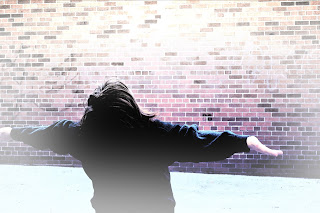
I think this Profile picture represents me pretty well because I usually accept, and try new things with open arms, like how I am in the picture. Though, not only is this showing that I do this, I believe that opening your arms wide is a sign of freedom, you telling the world that you don't care what people think, and that you're free to express yourself in any way that you'd like! and I feel the need to do that, since I think the same way.
After a little bit of playing around, I think the blue gradient that I used in the picture fit pretty well, since I like the colour blue quite a lot. And finally the bright areas in the picture, and me adding some white around to give a glowing feeling, and it represents me in the way that I am very bright, and like making the best of every situation :)
Thats how I think this profile picture represents me!


Repetition and Rhythm Assignment


For the Assignment, it was requested that we make a steady rhythm, and a dynamic rhythm using different types of lines. So, I am going to explain how I got a steady and dynamic rhythm with my two line arrangements. And of course I'm going to start with my steady line arrangement:

I believe that I made a fairly steady rhythm with the pattern of points repeating throughout the picture. Its simply repetitive, yet it’s the same arrangement of lines each time, except for the fact that the lines get thicker and thicker with each point. Its basically showing the rhythm getting denser, or louder with each beat, but at a steady pace, hence why I think it is pretty steady.


Next, is the dynamic rhythm. The only part of the rhythm that repeats itself is the lines emerging from the curved one at the bottom, and they all vary in thickness, and some distance, since some are further apart, while some are more close together. I believe the varying of the lines and the different distances create a dynamic rhythm, that doesn’t exactly go up at a steady paces, but a more creative one. 


Thursday, 12 September 2013

First blog, first post. Yay!

Heyy!! this is my very, VERY  first blog EVER. CyberARTS all the way, but i'm still kind of confused on how these blogs work ._. its like tumblr all over again! very confusing and whatnot! yet tumblr I just gave up on after the first five minutes...But yeah...first blog ever, and this is officially very first post!